Thursday, 17 November 2011

Music Magazine Research Write Up

What I've learned

Front Covers

On music magazine front covers a simple colour scheme is usually the most effective with three or four colours. Many magazines such as 'Q' and 'NME' use a simple colour scheme of red, white and black. The background is usually white with red and black text used in different areas. Different backgrounds are also used in contrast with the text to make it stand out more. This also gives the magazine a more professional look, a professional look will make the magazine more appealing to the audience. For example on the magazine to the right you can see that the skyline has a red background with white text on top of it. This text isn't the first thing to draw your eye but it is very effective at keeping your attention on the magazine. Furthermore the text that is displayed on the front cover can also be effective at getting the audiences attention depending on the font type, style and colour. On the cover to the left there isn't much variety of font type but most of the font is bold which grabs the audiences eye and is a solid font type as when it is used in a larger font it seems loud and empowering. The colour of the text can have an effect when one word is presented in a different font than the other parts of the sentence. For example the word "Coldplay" on the cover above is in yellow text while the other text is in white. This makes the word "Coldplay" stand out much more and with the bold and large font, this is an excellent way to grab your audiences attention and to get them to buy your magazine. Also anchorage text on the front cover should always be bigger than the sell lines to get the audiences attention more and so that it is able to be related to the main image more easily. The font size, colour and type should also be taken into account.

Contents Pages

I have learned that contents pages need not be too cluttered and by doing so my look unprofessional. The contents pages that I have analysed have some sort of housestyle. The contents page to the right ('Q' magazine) follows its housestyle on from the front cover with the red bar with the white letter 'Q'. This housetyle is what the magazine is known for and by continuing it onto the contents page makes the magazine look more professional. I have also learned that contents pages have more that one image that come in all different shapes and sizes. Some magazines separate different types of articles into different sections but the most popular section that is used the the featured section. This section allows the reader to quickly find an article that may have been advertised on the front cover of the magazine and this article may have been the reason that the person has bought the magazine. By including this section you are making the magazine look more professional and neatly layed out and may attract the reader into buying the magazine again because of this. Another feature of contents pages is that the article titles and page numbers are sometimes in different font colours to make the page number stand out from the article. This allows the reader to quickly find the article that they want to read and avoids any frustration that my arise when looking for the correct article.

Double Page Spreads

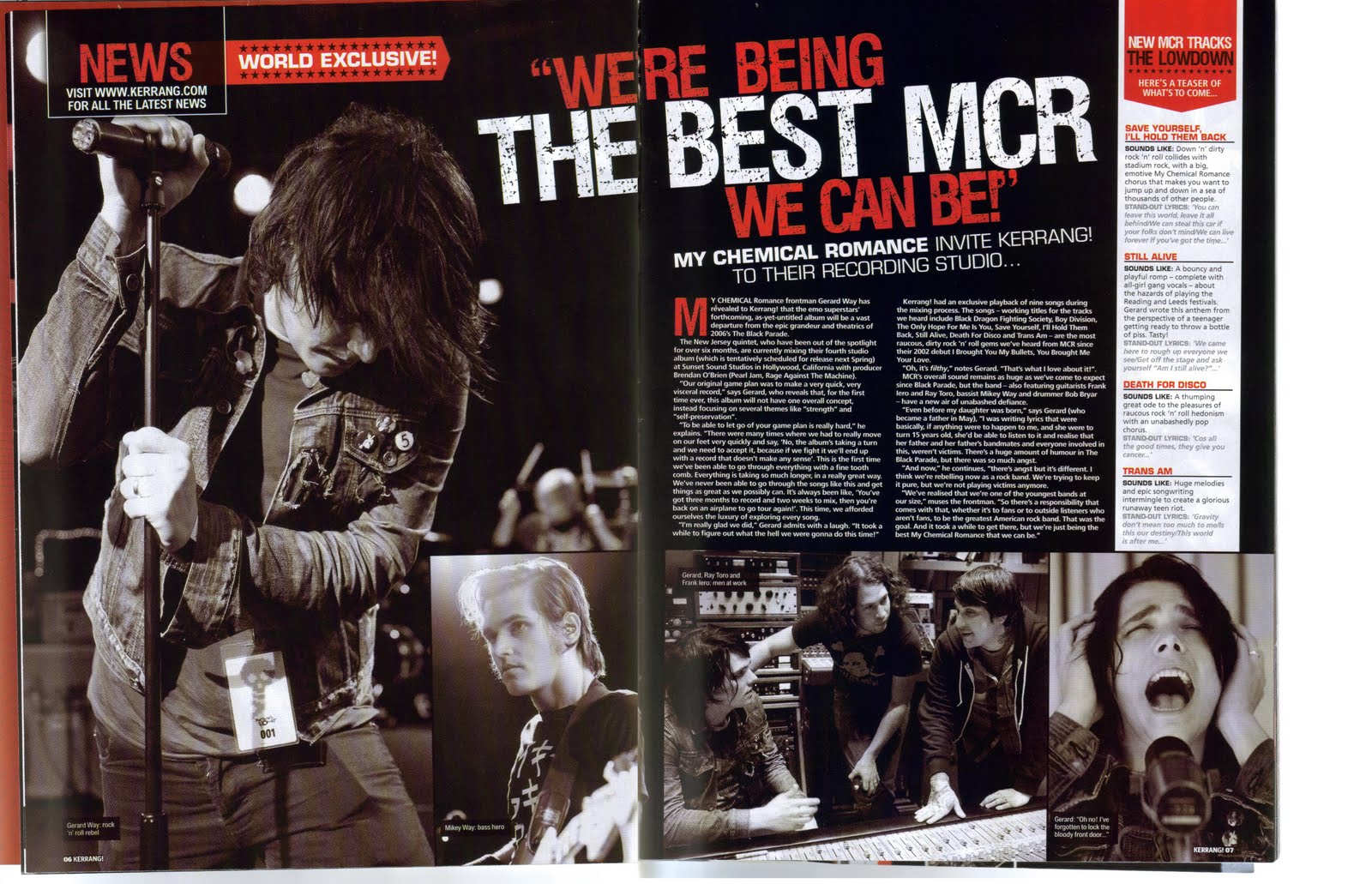
During my research I have learned that double page spreads don't always need to be full of text. Both pages don't even need to have text on them. Some magazines have one page with a large image on and the other with text. Double page spreads come in all shapes and sizes some are layed out very neatly whilst others will look more like a collage. The one to the left is a good example of one that is layed out neatly the image on the left is eye catching and the text is layed out is three neat columns that make the article more appealing to the target audience. The article below is from a magazine that has a slightly different target audience to the other double page spread. Many magazines are like this and are successful at keeping the reader interested. Double page spreads also have large mastheads to either fill space or to make the article look more appealing. Some double page spreads have many images but most will have one main image. Some double page spreads will try to add unique touches such as the world exclusive banner on the magazine below. Also there will be a variation in font styles, colours and sizes. The font size can vary in magazines for example the masthead is much larger than the text. Also the colour of the font is varied to make the text stand out more mostly in double page spreads the font colour is one colour in the article itself but other text on the page may be in different colour. This makes the page seem more professional and gives it a wider range of colour.

College Magazine Contents Annotation Three

College Magazine Cover Annotation Two

College Magazine Contents Annotation Two

College Magazine Contents Annotation One

Thursday, 3 November 2011

Magazine Reasearch: Double Page Spread

Double Page Spread One

This double page spread has on the left had side page a picture of Rihanna that takes up a whole page and immediately gets the readers attention. The shot used is a medium shot. At the top of the page there is the title of the article and Rihanna's name on its own in red text. There is a short introductory paragraph that is in bolder text from the rest of the page. This makes it stand out more to the reader and makes it more attractive to read. It also make the page look professional and more attractive to the audience. There is also a short red line just below this text that separates it from the rest of the page and helps to make the page look more professional and appealing to the audience.  The text on the rest of the page is in a small black font that stands out from the plain white background. The text is arranged into three vertical columns. The opening letter is the largest on the page, stands out and makes the article look more professional and attractive to the audience. Also at the top of the page there are two green bars that have text in between them. These bars make the article look more professional and attractive to the audience. At the bottom of the page there is a sectioned off part of the page that has the page number etc on.

Double Page Spread Two

This double page spread has a black background that blends into the images that are on the pages. There are several images on this double page spread the biggest of which is the image on the left had page that takes up the entire page apart from a small amount of text and a smaller image on the right hand side of the left page. The image is very eye catching and grabs the audiences attention. In the top left hand corner there is a small box with red and white text with another rectangular box coming out of it that states that the article is a world exclusive. This makes the article look very professional and makes it attractive to the audience.  This box is in red that makes it stand out. Slightly spreading across both pages is the masthead/title that is in both red and white. Both these colours stand out from the background. This makes the article more attractive to the audience. The white text is the biggest in the title and instantly gets the audiences attention. Just below is a small amount of text that acts as an introduction to the article. The actual article itself is quite small and it is organised into two columns that is very neat which makes it easier for the reader to read it. The neatness of the article will appeal to the audience. There are several smaller images on the right hand side page which are also in black and white. Both of these images have captions in small black boxes with white text which stands out and does not conflict with the image. This layout is professional looking and will be appealing to the audience. To the far right hand side there is a white text box that stands out from the rest of the page which gets the audiences attention. There is also a red bar at the top of the page that also gets the audiences attention. The text within the text box is neatly layed out has red underlined headings to make each of the sections of text stand out better. This also makes the magazine look more professional which in turn makes the article more attractive to the audience.

Magazine Research: Contents Pages

Contents Page One
This contents page has a very distinctive colour scheme of red, white and black. This colour scheme is also used on the magazines front cover. At the top of the page there is a banner that has the magazines logo/name on it. It is also clearly labelled contents and has the issue number clearly displayed this all makes the magazine look professional and therefore more appealing to the audience. There is a large image that takes up most of the room on the page.This immediately gets the audiences attention, there is also a large page number in the bottom left hand corner of the image which stands out from the image itself. The image is of a band that is well known and if the audience is flicking through the magazine and sees the image they may be further tempted into buying the magazine.
This contents page obviously spreads onto two pages because of the lack of articles listed. On the left hand side of the page there us a column that is neatly layed out and has a clear heading. This makes it more efficient for the audience to find the article that they want. This column is the featured article column so all the articles that are featured on the front cover etc are going to be here. This makes it even easier for the audience to find the article that they want to read and is very appealing to them. Typically on this contents page there is the page number and the article sitting on a red line with a quick snippet/taster of the article underneath. This professional look is very attractive to the audience which will increase the chances of the audience buying the magazine.

Contents Page Two

This contents page has a column running down the left had side of the page. This column is a band index so that if the audience is looking for information on a particular band then they can find it easily. There is also a masthead at the top of the contents page which has the magazines name/logo there and the words "this week" in white text. There is a black background to this bar/masthead at the top of the contents page so that the text will stand out more, this makes the contents page look more professional which makes it more attractive to the audience. There is also another column along the right hand side of the page that has some of the articles within, all put into different category's to make the page look neatly layed out and more attractive to the audience. For each section of the column is a heading that is in white text and has a black highlighted background. This helps to make the page look more professional. Underneath the headings are the articles, page numbers etc. The page numbers are in red text to make them stand out more. There is then text that gives a brief snippet of the article which also makes the contents page look more professional and therefore makes the audience much more likely to buy it. Also on the far left had side there are arrows pointing to articles that state that they were advertised on the front cover of the magazine. This allows the reader to easily find the article that they may have seen on the front cover and that they are interested in. This accessibility to advertised articles appeals to the audience. There is also an image in the middle of the page that is spilt into two to make it look more professional. Beneath this image is a mini article that gets the readers attention after the large image does. There is than a black box with yellow and white text that advertises subscriptions for the magazine.This makes the magazine look more professional to the audience and therefore more appealing. This contents page is also spread across two pages.

Tuesday, 1 November 2011

Contents annotation

This image is the biggest out of the three and shows around ten people that are happy and joyful which reflects on the whole contents page.

Music Magazine Research: Front Covers

Front Cover One

This magazines front cover follows a simple but effective colour scheme of red, white and the occasionally black. This colour scheme is used very well as it makes the magazine stand out and catches the audiences eye. The 'Q' logo/masthead is very distinctive and represents the magazine. Much of Q's audience is familiarised with the logo and this attracts them to the magazine. As you can see 'Q' is very fond of using a red background with white text which stands out to the audience. At the top of the page there is a strapline that follows the colour scheme with a red background and white text. The text on the strapline reads: "The essential music guide" This suggests to the reader that the magazine is a must have and for the hardcore music fan it is something that they cannot live without, which will make the magazine more appealing to the audience. Also on the logo there is a promotional sticker that has a black background with larger yellow text and smaller white text. This draws the readers attention and may lure them into buying the magazine. The main image is of the band Coldplay standing and looking at the camera. The camera shot is a medium shot. The main image is layered on top if the logo which give it a professional look which makes it more attractive to the audience and having the band Coldplay on the front cover of the magazine is a big selling point as it will further attract the audience. In front of the main image is the anchorage text. This text is bold and is in white and yellow and draws the attention of the reader. The world "Coldplay" is in yellow and is the largest text on the page which gets the attention of the audience and makes them more likely to buy the magazine. The barcode on the magazine is out of the way and does not conflict with the rest of the front cover. Also around the page there are many sell lines around the page with their own small image to attract the audience into buying the magazine. The price and the date of the magazine is printed at the bottom of the logo in white text. There is a wide viriaty of text colour on the front cover which is used to make certain words stand out, like "Coldplay" and "U2" which advertises the magazines articles which makes the magazine more appealing to the audience and makes them more likely to buy the magazine.

Front Cover Two

At the top of this front cover is a strapline that uses two colours of text black and red which makes it stand out more from the rest of the page. The masthead is in big bold text that grabs the attention of the audience and allows them to instantly recognise the magazine. The masthead is in red which stands out from the white background. The main image shows a musician looking directly at the camera in a medium shot towards the right hand side of the page. The anchorage text like the strapline is in two different colours to get the audiences attention. The first part of the text is in a smaller, black text while the end of the text which happens to be a persons name is in a bigger, red text that stands out and grabs the readers attention which and may tempt them into buying the magazine. There is also several types of font used in the anchorage text, the bigger pieces of the text are in a bold font while the smallest is in a thinner font and does not get the audiences attention as much as the other text straight away. There is also a promotional sticker on the front cover that is in a maroon red colour and has white text. This promotional sticker is advertising a competition to win £3000 worth of goods which will tempt the audience to buy the magazine and is very appealing to the target audience. The barcode on the front cover is out of the way and does not conflict with any other part of the page, thus making the magazine more appealing to the audience. Also at the top of the page there are two boxes that are different colours on black one white. This makes them stand out from each other. The box with the black background uses white and red text to make it stand out more while the box with a white background uses black and red text. There is also a strapline at the bottom of the page which also attracts the audience to buy the magazine.

Front Cover Three


On this front cover there is a strapline at the top of the page which has black background. The strapline also uses two colours of text to make it stand out more which makes it much more noticeable to the audience. The strapline is advertising an 8 page pull-out and shows an image of the pull-out to tempt the audience into buying the magazine. The masthead goes across the whole top of the page and is in white text and stands out from the background.  Also the main image show a member of Green Day looking to the left. The image is a low angle shot. The image is also quite large as well as the masthead which grabs the audiences attention. The anchorage text uses a highlighted effect in places to get the audiences attention above the larger "Green Day" text there is a green highlight with black text. The text "Green Day" is large and eye-catching which draws the audiences attention. The text below is highlighted black and has green text. This anchorage text gets the attention of the audience. There are also sell lines  along the left hand side of the page which also have different colour text to make it stand out and grab the audience's attention. There is also a smaller image on the right hand side with a sell line underneath. This image and sell line is in a yellow box which stands out from the rest of the page and gets the readers attention. The barcode is out of the way and does not conflict with the rest of the front cover. There is also a competition advertised on the front cover related to a band which appeals to the audience and makes them more likely to buy the magazine. There is also a promotional sticker on the front cover that advertises over 20 album reviews which will appeal to the target audience as they may want information on albums that they may be considering buying. The colour of this promotional sticker is bright green which stands out from the main image and the rest of the page. There is also another promotional sticker at the top of the page which has a black background and a yellow rim around the outside. There is yellow and white text in this promotional sticker to help make it stand out and appeal to the target audience. The sticker is advertising gigs which to the rock music fan is very appealing, which the magazine intends to used to their advantage so that the target audience will be likely to buy the magazine.

Tuesday, 18 October 2011

College Magazine evaluation

1. How does you media product represent particular social groups?

My media product is a college magazine. I have aimed my magazine at teenager’s aged 16-19 or college students. This target audience is not very wide and is focused on the particular social group that happens to be college students. To help represent my target audience on the front cover of my college magazine I have used a picture of a teenager (I have used a medium shot) that is looking directly at the camera. The person that I have used is carrying a folder has a bag. This shows that he is a college student and suggests that he is intelligent. In the background there is a building which suggests that the student is on a college ground which reinforces that the person is a student. The sell lines that I have used on my front cover appeal to college students which helps represent my target audience. The contents page of my magazine also represents the target audience because of the pictures that I have used of college students.

2. What kind of media institution might distribute your media product and why?

I would choose August Media to distribute my magazine. I would choose August Media because they are a multi award winning publisher that specialises in magazines. The awards that August Media have been awarded range from best use of photography to editor of the year. August media employs talented, creative and experienced individuals to get the job done. August Media has a reputation for getting the job done and has a very impressive website ( http://www.augustmedia.com/Default.aspx) that explains their company. The products that August Media produce professional magazines that are attractive to the audience and with their past experience and multiple awards they seem a perfect choice for a publisher.

3. Who would the audience be for your media product?

The primary audience for my magazine would be teenagers aged 16-19 (college students). The secondary audience for my magazine would be some teenagers aged below 16. Also within my secondary audience is parents who are sending their teenage children to college. I have chosen parents in my secondary audience because they might be concerned about their child at college and may want to know how to support them during their college life. I have also chosen teenagers below the age of 16 because they may use the magazine to get an insight into the college life and to help prepare them for college.

4. How did you attract/address your audience?

To attract my audience I have used a large masthead to firstly get the readers attention followed my the main image that is a medium shot of a college student that is looking directly at the camera looking happy and holding folders which suggests that he is a college student and is intelligent. I have also used sell lines that would attract the audience such as "NUS cards worth it or not?". I have used sell lines like this because they appeal to the target audience of college students. Also in the main image there is a college ground in the background which suggests that the student is within a college and emphasizes the fact that the person on the cover is a college student. Also within my contents page I have used may images of college students which attracts the primary and secondary audiences.

5. What have you learnt about technologies from the process of constructing this product?


During constructing my media product I have learned that the process includes a lot of trial, error and experimenting with the product itself. I have also learned that you should not become too attached with one specific feature of the product. Also technologies like Photoshop are extremely useful, because you are able to layer pictures and text on top of each other which is very useful when constructing the front cover. Photoshop also allows you to airbrush an image changing how it looks completely. It also allows you to change the colour of certain parts of an image and allows you to move parts of one image onto another creating an entirely new image altogether.